I’m doing #1000wordsofsummer challenge (kinda!) and I’ll be writing only about the history of photography as it relates to African Americans. This is post 7 of 14.
All pledges from Patreon and all proceeds from sales on thepicurious.com during June are being donated to the Fines & Fees fund of FRRC (Florida Rights Restoration Coalition) to help re-enfranchise voters who have served felony sentences.
On 6/12 I donated what I had raised so far and with a 2:1 match, the $150 from your contributions magically alchemized into $450 for the FRRC. I will continue to send any funds from new patrons or from Picurious to FRRC through the end of June.
____________
The posts I’ve done so far have been pretty heavy. History abounds with lesser known stories of the truth of African American oppression in America. I don’t want to only tell stories of oppression though.
Today’s post is one that originated as a writing exercise in my History of Photography class. That class is what’s called a “Gordon Rule” class, which in the Florida university system means that it is a writing-intensive course. Students have to meet a minimum writing requirement of 4,500 words over the course of the semester. During a fall or spring semester of 16 weeks, this is met rather easily via regular assignments, essay tests, and their semester-long curating project. During summer classes, however, the same 4,500 words have to be written in half the time. Because we have longer class periods in the summer, I start each class with a 15-minute timed writing where I put an image on the screen and students do a focused visual analysis of just the one image. The goal is to teach them that interpretation can come from looking–that there is meaning present in photographs, and that with close looking, you gather some of that meaning just by observing what is present within the frame.
The first time I taught HoP in a summer term, I did the timed writings along with my students. Part of this post is what I wrote in those 15 minutes (the writing in italics), but I’ve expanded (and in some cases corrected my original assumptions) since I’m now looking at it with the ability to do some quick research 🙂
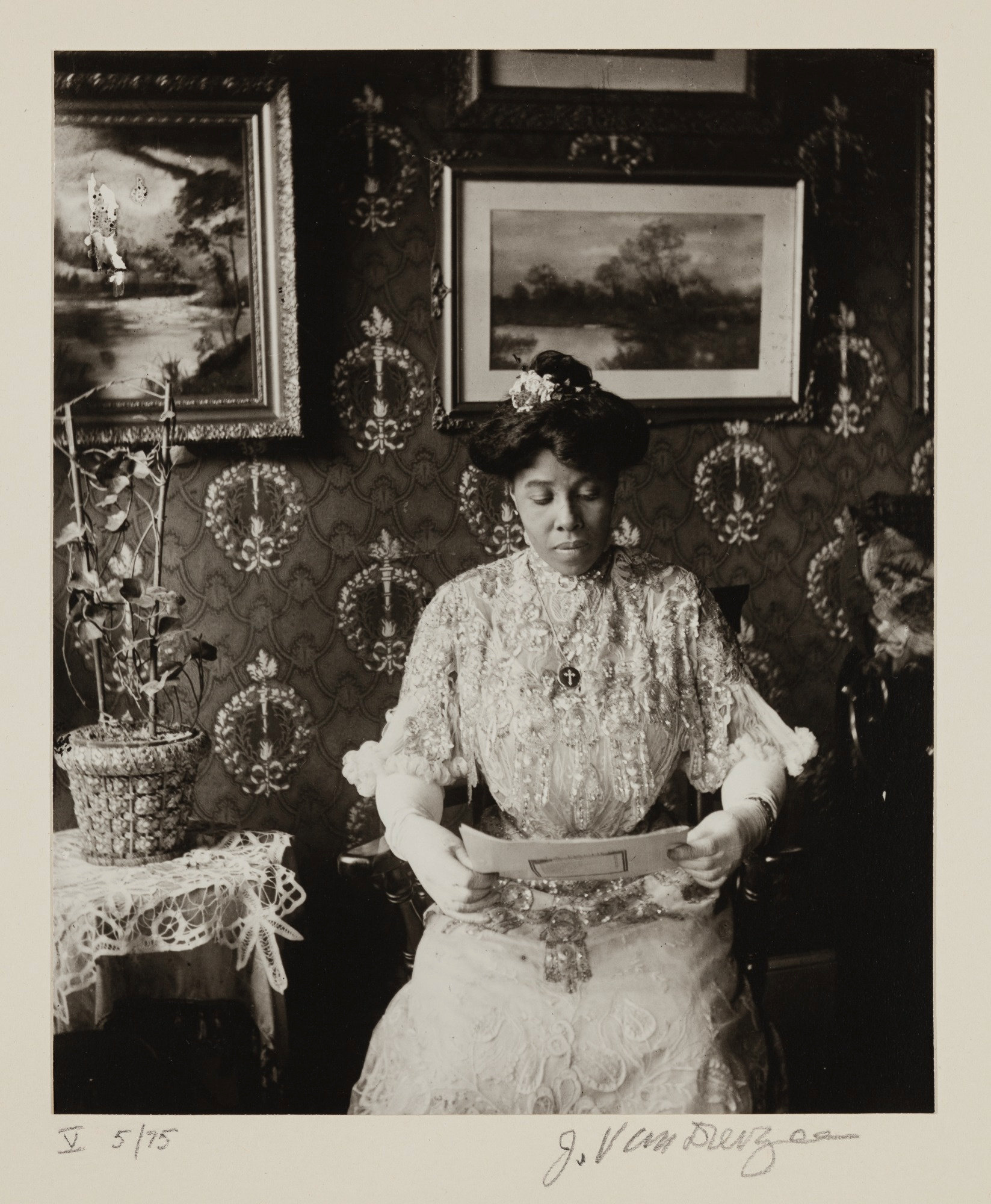
Cousin Susan Porter (1915), James Van Der Zee
A finely dressed African American woman sits in a sumptuous parlor. The walls are covered in wallpaper reminiscent of the French Regency era. Behind her are paintings—two landscapes are within the frame of the photo and two more painting frames are visible at the top and right edges. Beside her, a plant sits on a lace-draped table. Her own dress is made of fine lace and accented with embroidery. She wears white gloves and is ignoring the camera, instead looking down at papers she is reading. Her hair, presumably long, is coiffed in a high bun with a flower in it. In all, this scene communicates wealth, education, and status in upper-class society.
In 1915, it is possible that several generations of black Americans had established themselves financially, especially in the north (James Van Der Zee’s studio was in Harlem). In the previous essay about Glenalvin Goodridge, I noted that his father owned significant parcels of property, and that was in the 1840s. I haven’t had much success learning about Susan herself, at least not in the couple of hours that I’ve been working on this post. I don’t know if Porter is her maiden or married name. What I do know is that Harlem had socialites, and based on the visual cues from Susan’s surroundings and clothing, she was likely one of them.
I know Van Der Zee used painted backdrops to create the look of money, but this doesn’t look like one to me. In trying to find out more about Susan, I found a note in Duke University’s Library that this is in fact Susan Porter’s home in Harlem.
The paintings, in my opinion, are likely to have been passed down. As the house may have been. The paintings signify generational wealth maybe more than anything else within the image. This was my assumption on first studying the image, but it’s not something that I can support yet. I think I had recently watched that episode of Downton Abbey where Mary was engaged to the newspaper magnate and he wanted to buy them an estate, but the house had been cleared of all of the family’s accumulated furniture, art, and other objects—in other words the markers of generational wealth and accumulation. So I was initially making assumptions about the availability of art on the secondary market that really I don’t know anything about. Whether the paintings were inherited or not, they are still signifiers of disposable income and appreciation of beautiful objects that don’t have any use value.
Whether or not the home could have been inherited or not I also don’t know. With some quick research, I learned that during the decades leading up to the period known as the Harlem Renaissance, Harlem experienced a couple of real estate booms, so whether the home was in the family for a while or not isn’t an assumption that can be supported at the moment.
Plants almost always stand for growth and abundance, since that’s all plants do is grow, but in this case it is also an indication that the room received enough light for the plant to grow. Anyone who lives in a high-density area knows that if there are lots of buildings around, you may not get much light inside your home. I think the plant is signaling a lot more than just abundance, I really think could be referencing land and space outside the home. Again, without knowing the specifics of this home, I can’t say for sure, but perhaps the plant is shorthand for a garden, or for a little bit of as-yet undeveloped land around Susan’s home.
I wonder what she’s reading. It doesn’t look like a newspaper. Maybe a broadsheet? There is some kind of square design on the back. Marianne Hirsch mentions this photograph in her book The Familial Gaze and indicates that it’s sheet music! I don’t love the way Hirsch situates this photo solely as a picture that creates a sense of aspirational social status.I would agree that this may be an appropriate way to interpret photographs taken at Van Der Zee’s studio, where customers had access to his collection of backdrops and props.
However, the setting of this portrait within her home rather than her cousin’s studio indicates that Susan is not aspiring to wealth and social status—it is already established.
Susan is ignoring the camera. Knowing that James Van Der Zee is her cousin, there’s a sense of familial intimacy that comes from her pose. This is an unguarded, relatively unselfconscious pose for a portrait. I mean, don’t get me wrong, I believe it is 100% on purpose, not an accident, that she is looking away from the camera. But it makes the viewer ask the question and wonder whether he happened to catch her in a private moment.
In art, the subject of a woman reading is powerful. She is in her own private thoughts. We the viewers don’t have access to what she’s thinking, and in this case we don’t even have access to her eyes. She does not acknowledge the presence of the viewer because she is otherwise occupied. According to Kathryn Brown, author of Women Readers in French Painting 1870-1890: A Space for the Imagination:
“By the middle of the nineteenth century, the ‘woman reader’ had become a well known figure in French art. Capable of invoking themes of intellectual transgression or modest subjection to textual influence [likely depending on what they were reading, i.e., a novel or the Bible], an open book was an effective way of communicating information about a woman’s intellect, social standing, personal relationships, and private morality.” (brackets mine)
Women readers in art embody subjectivity and interiority—their thoughts can’t be communicated visually therefore viewers don’t get access to that part of the woman. Now that I know that Susan is reading music, my sense of her as a consumer of culture fine art (including music, theater, and dance) is deepened. I wonder what she plays, and what instruments she may have in her home. I think it is absolutely appropriate to assume that Van Der Zee and/or Susan, were familiar with impressionist paintings of the liseuse figure. This is yet another way to read Susan as a cosmopolitan woman who knows of major art movements and popular subject matter.
In the case of Susan, a black woman reading adds additional levels of signification. Though women didn’t yet have the vote at the time this portrait was made, whether or not an African American man could read determined whether or not he could vote. It was in 1915 that the grandfather clause, a loophole enabling mass voter suppression especially in former slave states, was deemed unconstitutional in Guinn vs. United States. For Black citizens, reading was an inherently political act.
Her dress is so stunning. White is not a color for people who are doing any kind of work. Or messing with kids. This is formal wear. Gloves. It didn’t occur to me until I wrote the paragraph above that Susan’s white dress itself could be making a political statement about women’s suffrage. It is well established that white women tried their hardest to exclude black women from their movement. The same year this photograph was made, and several years yet before the 19th amendment was ratified, black feminists fought their own battle on two fronts—race and gender.
“The opposition African American women faced was the subject of NACW [National Association of Colored Women] and NAACP leader Mary B. Talbert’s 1915 Crisis article, “Women and Colored Women.” As Talbert pointed out, ‘with us as colored women, this struggle becomes two-fold, first, because we are women and second, because we are colored women.’ Talbert’s essay was one of several by a small cadre of Black female and male intellectuals and public figures who had participated in a symposium on “Votes for Women” and whose remarks appeared in the August 1915 issue of the Crisis, the national organ of the NAACP.” —”African American Women and the Nineteenth Amendment”
“Suffragette White” became popular, in part, because of photography. In the early 1900s, suffragettes identified with three colors: purple, yellow, and white, and they wore those three colors at marches and rallies. But they soon found that head-to-toe white was more visually effective branding: “When black-and-white photography was the primary form of visual documentation, white provided a clear and bright contrast on the front pages of newspapers, attracting the eye of readers.”
Aside from the flower in her hair her lone accessory is a medallion with an inlaid cross. Is the music she’s holding a hymn? The prominence and legibility of the simple cross medallion she wears is yet another way for the viewer to know something about Susan’s values.
I’m so interested to know more about Susan Porter that I’m tempted to reactivate my Ancestry subscription! More about the photographer, James Van Der Zee, another time!









0 Comments